3.2 Evolutionary biology
For this part of the tutorial, we need to load the tidyverse package.
3.2.1 The Hardy-Weinberg Model
The HW model is a way of demonstrating the relationship between allele and genotype frequencies. It is mathematically basic but very important for understanding how different processes can alter these frequencies. As you might recall from the main text, the model has five major assumptions:
- All individuals in the population mate randomly.
- The population is infinitely large.
- No selection occurs.
- No mutation occurs.
- No gene flow occurs.
Imagining our idealized population, we will focus on a single locus, \(A\) which has two alleles, \(A_1\) and \(A_2\). We can use \(p\) to denote the frequency of the \(A_1\) allele and \(q\) for \(A_2\). This means that if we know \(p\), we can derive \(q\) as \(q = 1- p\), since \(p + q = 1\). Remember that the HW-model is a means of representing the relationship between allele and genotype frequencies across generations. With our assumptions outlined above in place, the only thing that determines the frequency of genotypes is their probabilities, derived from the allele frequencies.
It is quite simple to determine these probabilities. With 2 alleles \(A_1\) and \(A_2\), we have three possible genotypes and three ways to determine their probabilities as:
- \(A_1A_1 = p^2\)
- \(A_1A_2 = 2pq\)
- \(A_2A_2 = q^2\)
Another way to look at these probabilities is as the expected frequencies of the three genotypes at Hardy-Weinberg equilibrium given the allele frequencies. Let’s use some R code to actually demonstrate how we might calculate these expected frequencies. For our test example, we will use a simple case where the frequency of \(A_1\), \(p\) is 0.8 and the frequency of \(A_2\), \(q\) is 0.2.
# first we set the frequencies
p <- 0.8
q <- 1 - p
# check p and q are equal to 1
(q + p) == 1
# calculate the expected genotype frequencies (_e denotes expected)
A1A1_e <- p^2
A1A2_e <- 2 * (p * q)
A2A2_e <- q^2
# show the genotype frequencies in the console
c(A1A1_e, A1A2_e, A2A2_e)
# since these are genotype frequencies, they should also sum to 1 - you can check this like so
sum(c(A1A1_e, A1A2_e, A2A2_e))
So you can see it is quite easy to calculate the frequencies you need for the HW model in R. If you want to, you can play around with the initial frequencies defined at the start of the R code to see how it alters the genotype frequencies. This is one nice thing about using R for evolutionary genetics, it is pretty simple to demonstrate things mathematically to benefit your own understanding. However, it might be even more useful to demonstrate the relationships the HW model lays out graphically. That way you can see how the expected genotype frequencies are altered over a whole range of allele frequencies. Luckily for us, R is great for this sort of visualisation and this is an excellent opportunity to demonstrate some programming in R.
3.2.1.1 Plotting the expected genotype frequencies
The first thing we need to do is generate a range of allele frequencies to visualize the expected genotype frequencies across. We’ll do this in the simplest way first, before going into how you might take a programming approach to the same problem. Either way, generating a range is simple - we just need to do it for a single allele, \(A_1\) and then we can very easily derive the frequency of \(A_2\). We will do this like so:
Here we used the seq() function, which we first saw back in Chapter 1. Remember, we only have to do it once because \(q\) is the inverse of \(p\). Next we need to generate the expected frequencies. Because R is great at handling vectors, the code for this is identical for if we were using a single value.
So now we have the expected frequencies at HWE of our different genotypes across a range of allele frequencies with a little vector calculation. However, recalling from before that we often need to get our data into a data.frame in order to use ggplot2, we need to do a bit of work on this first. We’ll now get our data into a data.frame ready for working on…
# arrange allele frequencies into a tibble/data.frame
geno_freq <- data.frame(p, q, A1A1_e, A1A2_e, A2A2_e)You also might remember from the previous session that we need to sometimes do some data manipulation to get the data into a form that we can easily plot. Luckily, this is quite straightforward in this case as we can use the pivot_longer function to do it quickly and easily.
# Use pivot_longer to reshape the data.frame for straightforward plotting
geno_freq <- pivot_longer(geno_freq, c(A1A1_e, A1A2_e, A2A2_e),
names_to = "genotype",
values_to = "freq")pivot_longer() commands can take a while to get the hang of, the best thing is to continually practice them like this! If you’re unsure why we use pivot_longer() or how it works, you can always go back to the explanation from week 2.
Now it is really straightforward to make a plot that shows the expected HW—frequencies across our allele frequencies.
# plot the expected genotype frequencies
a <- ggplot(geno_freq, aes(p, freq, colour = genotype)) +
geom_line() +
labs(x = "p frequency", y = "Genotype frequency")
# print the plot with some theme options to make it pretty
a + theme_light() + theme(legend.position = "bottom")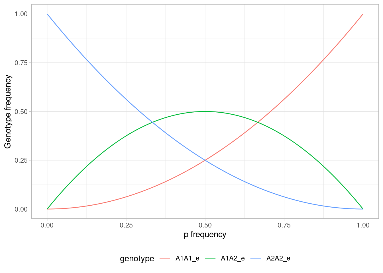
Figure 3.1: Relationship between allele frequency and genotype frequency under Hardy-Weinberg equilibrium.
From this graph, you can find the expected genotype frequencies for any value of \(p\). Note for instance how at \(p=0.5\), the frequencies are 0.25 for each of the homozygotes, and 0.5 for the heterozygote. At fixation of \(A_1\) (\(p=1\)), you can see that we (of course) only have A1A1 homozygotes, and vice versa for \(p=0\).
3.2.2 Testing for deviations from the Hardy Weinberg Expectation
We’ve already learned that the HW model is essentially an idealised scenario where no demographic or evolutionary processes are shaping the relationship between allele and genotype frequencies. We can therefore use it as a null model against which to test our data. Basically, we can compare our observed genotype frequencies from those expected under HWE. To get the expected frequencies, we just generate them from the allele frequencies, as we did in the previous section of the tutorial.
We can work through an example of this together. Once again we’ll assume a locus \(A\) with two alleles, \(A_1\) and \(A_2\). This means three genotypes, \(A_1A_1\), \(A_1A_2\) and \(A_2A_2\). We sample 150 individuals from a population. The next block of R code shows the numbers of each genotype we collected and also combines them into an observed vector - for later use.
# numbers of genotypes
A1A1 <- 80
A1A2 <- 15
A2A2 <- 55
# make into a vector
observed <- c(A1A1, A1A2, A2A2)In order to go further here, we need to work out the allele frequencies from our observed data. This is quite straightforward - homozygotes have two copies of an allele whereas heterozygotes have only one. So we derive the number of each allele and divide it by the total:
- \(\displaystyle p = \frac{2(A_1A_1) + A_1A_2}{n}\)
- \(\displaystyle q = \frac{2(A_2A_2) + A_1A_2}{n}\)
Where the genotype notation here represents the number of genotype class and \(n\) is the total number of alleles. We can calculate the frequency the alleles in R like so:
# calculate total number of alleles
n <- 2*sum(observed)
# calculate frequency of A1 or p
p <- (2*(A1A1) + A1A2)/n
# calculate frequency of A2 or q
q <- (2*(A2A2) + A1A2)/n
# print frequencies to screen
c(p, q)Note that with the code above, we summed the number of observed genotypes and then multiplied by 2 as there are 2 alleles for each individual (i.e. there are 150 individuals and 300 alleles). We now have the allele frequencies, so we can use the code we worked out in the previous section to calculate the expected Hardy-Weinberg frequencies for this population.
# generate the expected genotype frequencies
A1A1_e <- p^2
A1A2_e <- 2 * (p * q)
A2A2_e <- q^2
# combine into a vector
expected_freq <- c(A1A1_e, A1A2_e, A2A2_e)So now that we have the expected genotype frequencies, the last thing we need to do before testing whether there is a deviation from HWE in our data is calculate the expected number of each genotype. This is easy - we just multiply the frequencies by the number of individuals we sampled - 150.
The next thing we’d like to do is see whether our observed genotypes deviate from the expected. We will test this formally, but first let’s just look at the differences between them. The simplest way to do this is combine them into a matrix:
# combine observed and expected frequencies into a matrix
mydata <- cbind(observed, expected)
# add rownames
rownames(mydata) <- c("A1A1", "A1A2", "A2A2")

mydata
#>      observed expected
#> A1A1       80 51.04167
#> A1A2       15 72.91667
#> A2A2       55 26.04167
Well, just from eyeballing this matrix, we see that there is a difference between the expected and the observed genotypes. Notably there seems to be a lower frequency of heterozygotes than we expect. Still, just looking at this is not enough, we need to test it formally. As you will probably remember from the main text, we can use a Chi-squared goodness of fit test for this purpose.
When we use a statistical test like the Chi-squared test, we want to find out how likely it is that we would get our observed values when we assume that our null hypothesis is true. Here, our null hypothesis is the Hardy-Weinberg expectation (\(p^2\), \(2pq\), \(q^2\)). These are the genotype frequencies we would expect to see if the population was in Hardy-Weinberg equilibrium. If the difference between the observed data and the expectation from the null hypothesis is large enough, we can say that it is statistically significant. What is “large enough” is what our chi squared test will tell us – this is where the p-value comes in. If we get a low p-value, we can reject the null hypothesis and conclude that our population is not in Hardy-Weinberg equilibrium.
p-values:
A p-value tells us the probability of getting our observed result when we assume that the null hypothesis is true. For example, a p-value of 0.5 means that if we randomly sampled 150 individuals from a population in Hardy-Weinberg equilibrium, we would get results like ours or more extreme 50% of the time.
We typically say that if the p-value is below 0.05, the results are statistically significant. If our p-value is 0.05, it means there is a probability of only 5% that we would get these results if our null hypothesis was true.18
Important: it may be confusing that both the probability in hypothesis testing and the proportion of the \(A_1A_1\) allele in a population is called p. These are two completely different statistics, so make sure you don’t get them mixed up!
In the book, we calculated our chi-squared manually. In R, we can simply use the function chisq.test():
Note that what we put into the function is the number of observed genotypes (stored in our observed variable) and the frequency of the expectation (stored in expected_freq).
Then we can have a look at the results:
mychi
#>
#>  Chi-squared test for given probabilities
#>
#> data:  observed
#> X-squared = 94.633, df = 2, p-value < 2.2e-16
We see that the p-value is very low - well below our limit of 0.05. This means we have a significant deviation from HWE - in other words, some assumption of the Hardy-Weinberg model is violated. What process could cause this significant heterozygote deficit? And conversely, what about the excess of homozygotes? Maybe non-random mating could be a possible reason?
3.2.3 Simulating genetic drift
One of the main assumptions of the HW model is that populations are infinite. This is obviously unrealistic! All populations are finite - but what does this mean for how evolution unfolds? An important concept in evolutionary genetics is how population size can influence the relative power of a process such as genetic drift. Drift essentially describes the random component of survival in a population - some individuals will survive and reproduce more than others by chance. An important factor contributing to such genetic drift is the random sampling of alleles that takes place at fertilization. For instance, just like some pairs produce an excess of sons and daughters, a heterozygous mating pair (\(A_1A_2\)) can produce offspring with an excess of the genotypes \(A_1A_1\) (or \(A_2A_2\)) thereby causing a random change in allele frequency in the population. When a population is large, the effects of drift will be small relative to other processes such as selection. However, when a population is small, drift as a result of random chance has a much bigger effect.
One of the best ways to get your head around a concept like genetic drift and how it interacts with population size is to actually simulate, which is exactly what we are going to do here. We’ll first explain how we can simulate it over a single generation and then we are going to use a for-loop to do all the leg work for us. So we’ll not only be exercising your understanding in evolutionary genetics, but your R programming chops too.
3.2.3.1 A simple case of genetic drift over a single generation using the binomial distribution
To demonstrate a simple case of drift, we’ll use the example from the book. We have a population of N = 8 individuals and we will focus on a single locus A with two alleles, \(A_1\) and \(A_2\). We will assume both alleles are equally common in the population - i.e. \(p=q = 0.5\).
In the book you will recall we used a coin-flipping experiment to sample our alleles to form genotypes, since both alleles have a frequency of 0.5. Now we will do something similar, but instead of sampling alleles to form genotypes, we will sample the number of \(A_1\) alleles in the next generation directly (we call this \(p’\)). In the example in the book, we defined heads as \(A_1\) and tails as \(A_2\). The principle here is the same, we start with a population where \(p = q\), so there is an equal probabilty of sampling one allele or the other. You can imagine each coin flip representing the passing on of one allele from a parent to the next generation. If we do this twice for each individual in the population, the sum of the heads we get will be the number of A1 alleles in the next generation.
This is a form of binomial sampling, and to do it ir R we can use the rbinom() function. rbinom() essentially simulates a coin flip. However, while in a regular coin flip the probability of heads and tails is always 0.5, rbinom() allows for changing these probabilities. Simplified, the following code says: “flip 1 coin (n) 16 times (size) with a probability of 0.5 (prob) for getting heads”. The output is the number of heads we got.
Run this code a few times, and observe that the results are different each time, because the rbinom() function samples randomly.
In our example, the output of rbinom could represent the number of \(A_1\) alleles in the next generation – so we could easily work out \(p´\) and \(q´\), (i.e. \(p\) and \(q\) in the next generation). We can use the following code to sample the number of \(A_1\) in generation 2:
# set population size
N <- 8
# set allele frequency
p <- 0.5
# recreate coin flipping experiment using binomial sampling
nA1 <- rbinom(1, size = 2*N, prob = p)
Remember since we are sampling alleles for diploid individuals, we need to multiply N by 2. The value of nA1 will differ for everyone since this is a random sample of the binomial distribution. We can now easily work out the value of \(p´\) - i.e. the new frequency of the \(A_1\) in the next generation. Note that R doesn’t allow the prime notation so for the actual R code, we will use p2.
OK, so now we have a value for p2 – again it will differ for everyone because we performed random sampling. You will see though that p2 is likely different to p solely because of random sampling - i.e. we have demonstrated drift over a single generation. Then we can go on to calculate \(p\) in the third generation. Our new p2 will then be the prob argument of rbinom(), and everything else can be left unchanged:
# draw a new random sample
nA1 <- rbinom(1, size = 2*N, prob = p2)
# calculate p in generation 3
p3 <- nA1/(2*N)
p3
#> [1] 0.25
If we were to to properly understand drift over more than one generation, we could now have used our p3 to find p in the fourth generation, use the new \(p\) to calculate \(p\) in the next generation, and so on until we have simulated for all the number of generations we want.
# draw a new random sample
nA1 <- rbinom(1, size = 2*N, prob = p3)
# calculate p in generation 4
p4 <- nA1/(2*N)
p4
#> [1] 0.1875
# draw a new random sample
nA1 <- rbinom(1, size = 2*N, prob = p4)
# calculate p in generation 5
p5 <- nA1/(2*N)
p5
#> [1] 0.0625But hopefully, you’re thinking: “that sounds like a lot of work, maybe we can use a for-loop instead?”. We can!
3.2.3.2 Using a for-loop to simulate drift over multiple generations
Let’s do try to wrap all that tedious code in a for loop instead. If we simplify our problem by a lot, what we want to do is: “use p from the previous generation to calculate p in this generation”. If your p-values are in a vector p, and you are using indexing like we learned in section 3.1.3, “p from the previous generation” is p[i-1], and “p in this generation” is p[i]. The contents of our for-loop would then be:
All that remains then is to create the for-loop itself. See if you manage to make this yourself before looking at my code!
Show hint
Hint: start by creating a vector p to store your results. The length of this vector determines how many generations you use in your simulation. Then, set the first element of p to 0.5
Show another hint
Hint: start the vector you’re looping over at 2, and end at the number of generations (i.e. the length of your p vector)
# set population size
N <- 8

# set number of generations
ngen <- 100

# set initial frequency of A1
p_init <- 0.5

# create vector for storing results
p <- rep(NA, ngen)
# set first element to initial p
p[1] <- p_init


for (i in 2:ngen){
  # sample number of A1 alleles based on p in previous generation
  nA1 <- rbinom(1, 2*N, p[i-1])

  # set frequency of A1 as p in the current generation
  p[i] <- nA1 / (2*N)
}

p
#>   [1] 0.5000 0.5000 0.4375 0.5625 0.5625 0.6250 0.6250 0.6875 0.5625 0.7500
#>  [11] 0.6875 0.6250 0.5625 0.4375 0.6250 0.5625 0.7500 0.8750 0.8125 0.7500
#>  [21] 0.6875 0.8125 0.6250 0.5625 0.7500 0.7500 0.8125 0.9375 0.9375 0.8750
#>  [31] 0.8750 0.8125 0.5625 0.8125 0.7500 0.6875 0.8125 0.8750 0.8750 0.8125
#>  [41] 0.8125 0.9375 0.8125 0.8125 0.9375 1.0000 1.0000 1.0000 1.0000 1.0000
#>  [51] 1.0000 1.0000 1.0000 1.0000 1.0000 1.0000 1.0000 1.0000 1.0000 1.0000
#>  [61] 1.0000 1.0000 1.0000 1.0000 1.0000 1.0000 1.0000 1.0000 1.0000 1.0000
#>  [71] 1.0000 1.0000 1.0000 1.0000 1.0000 1.0000 1.0000 1.0000 1.0000 1.0000
#>  [81] 1.0000 1.0000 1.0000 1.0000 1.0000 1.0000 1.0000 1.0000 1.0000 1.0000
#>  [91] 1.0000 1.0000 1.0000 1.0000 1.0000 1.0000 1.0000 1.0000 1.0000 1.0000
Note that I assigned the population size N, the number of generations ngen and the initial frequency of \(A_1\) p_init to named objects. This way, if you want to change either of these, you only need to change them in one place!
3.2.3.3 Visualizing drift
Now that we our for-loop to simulate data across generations, we can easily do this for different population sizes. Let’s simulate 1000 generations of drift for three populations of 10, 100 and 1000 individuals. We’ll keep the initial allele frequency, p at 0.5 in all cases. We will then combine them all into a data.frame alongside the number of generations. I will skip most of the comments in the code here so the code doesn’t take up too much space, but remember that you can look at the code in the previous section if you wonder what something does.
First, for a population size of 10, storing the results to an object called n10
# Population size 10
N <- 10
ngen <- 1000
p_init <- 0.5

n10 <- rep(NA, ngen)
n10[1] <- p_init

for (i in 2:ngen){
  nA1 <- rbinom(1, 2*N, n10[i-1])
  n10[i] <- nA1 / (2*N)
}
Then we do the same for a population size of 100.
# Population size 100
N <- 100
ngen <- 1000
p_init <- 0.5

n100 <- rep(NA, ngen)
n100[1] <- p_init

for (i in 2:ngen){
  nA1 <- rbinom(1, 2*N, n100[i-1])
  n100[i] <- nA1 / (2*N)
}
And finally for population size 1000.
# Population size 1000
N <- 1000
ngen <- 1000
p_init <- 0.5

n1000 <- rep(NA, ngen)
n1000[1] <- p_init

for (i in 2:ngen){
  nA1 <- rbinom(1, 2*N, n1000[i-1])
  n1000[i] <- nA1 / (2*N)
}
As you may remember, we need to make it into a data frame in order to plot it with ggplot2. We also add a column called g that contains the number of generations.
# get number of generations
g <- seq(1, 1000, 1)

# combine into a data.frame
mydrift <- data.frame(g, n10, n100, n1000)
Anyway, what we ultimately want to do is visualise drift over time. So we need to get our data in a position to plot it using ggplot2 - once again, we turn to pivot_longer(). pivot_longer() in this case takes all our simulations (which at the moment are in different columns) and combines them into a single column p. A new column pop_size is made which indicates the name of the column where the data came from.
# use pivot_longer to get data ready for plotting
mydrift_long <- pivot_longer(mydrift, -g, names_to = "pop_size", values_to = "p")
Now we will plot our data using the following code:
# plot data
p <- ggplot(mydrift_long, aes(g, p, colour = pop_size)) +
  geom_line() +
  labs(x = "No. generations", y = "Allele freq (p)")

# print nicely with some theme options
p + theme_bw() + theme(legend.position = "bottom") 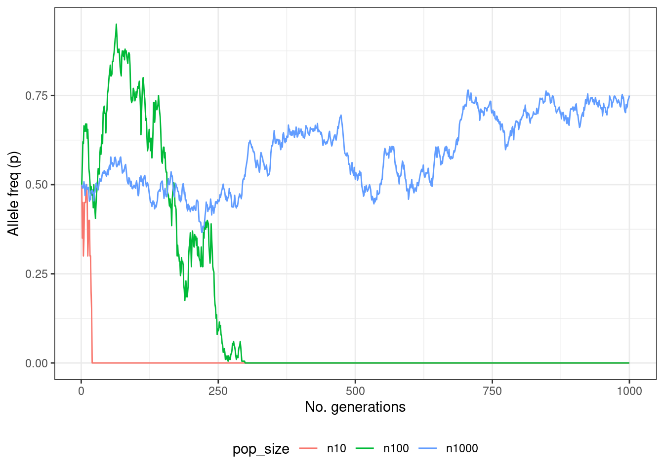
Figure 3.2: A simulation of genetic drift over 1000 generations with different population sizes.
And there we have it! A plot of our simulated data showing allele frequency changes over time as a result of genetic drift. Although the plot you get will differ from the one you see here (because of the random sampling), what you should be able to see is that with a low population size alleles are either lost or go to fixation very rapidly. This is because the effect of drift is much stronger here, whereas in larger populations it may take a long time for drift to fix or remove an allele - indeed in some cases it will not happen at all.
Keep in mind that the value 0.05 is arbitrary, and that other (often lower) values are often used in other fields. Researchers simply decided that 5% is an acceptable degree of error. This also means that 5% of studies conducted (where the statistics are done correctly) will come to the wrong conclusion.↩︎