5.3 Visualising FST along a chromosome
Next, we will combine vectorisation and our custom functions to calculate FST for a series of SNPs in the vicinity of the LCT gene on chromosome 2. This is essentially a genome scan, an approach that can be used to detect signatures of selection in the genome. You can download the data here
Exercise: Read in the file LCT_snps.tsv.
This data is also from Bersaglieri et al. 2002. It is the allele frequency in various human populations for one allele at a set of 101 biallelic SNP markers close to the LCT gene on chromosome 2 in the human gene. Each row is a SNP and there are three frequencies - one for North Americans of European descent, one for African Americans and one for East Asians.
Since we have the allele frequencies, we can easily calculate FST for each of these SNPs. For our example here, we will do this between european_americans and east_asians. First of all, let’s use our calc_fst function on just a single SNP.
So it works great for a single row. Actually, calc_fst() will work with vectors of values as well, so to calculate the FST for all loci simultaneously, we can supply the entire columns as arguments with the $ operator.
It works equally great for the entire data set! Let’s add these FSTs as a column in the lct_snps data frame.
Now that we have FST estimates for each of our SNPs, we can visualise the variation along the chromosome with ggplot2.
a <- ggplot(lct_snps, aes(coord, fst)) + geom_point()
a <- a + xlab("Position (Mb)") + ylab(expression(italic(F)[ST]))
a <- a + theme_light()
a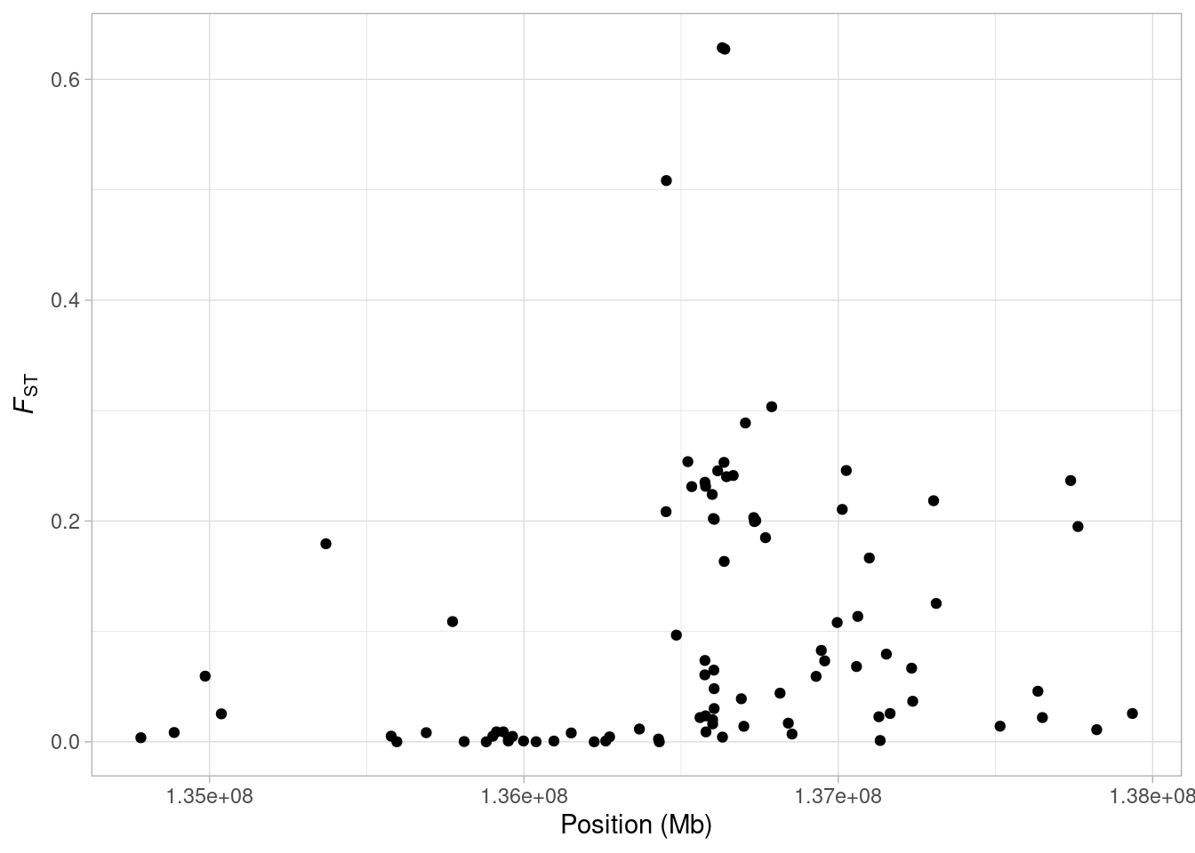
What are we seeing here? Quite clearly, there is a an increase in FST along the chromosome, with a few SNPs showing extremely high values. It might make things a bit clearer if we mark on our plot the midpoint of the LCT gene. We know the gene occurs between 136,261,885 bp and 136,311,220 bp on Chromsome 2 (from the UCSC Genome Browser). So first we will find the midpoint of the gene.
# define the start and stop positions of the gene
lct_start <- 136261885
lct_stop <- 136311220
# calculate the midpoint
lct_mid <- (lct_start + lct_stop)/2
All we need to do to add it to our plot is add the geom_vline() geom.
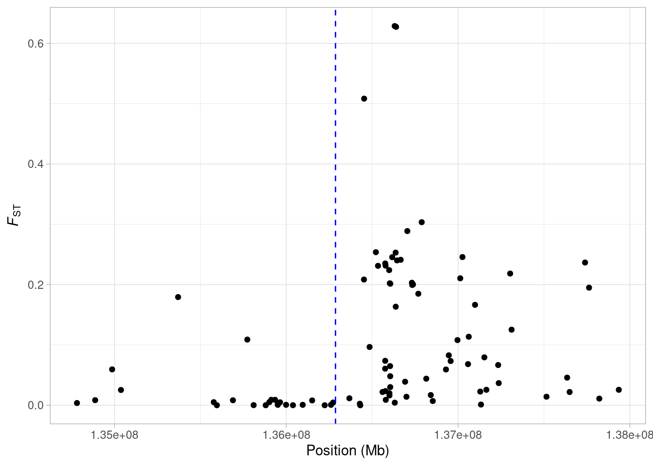
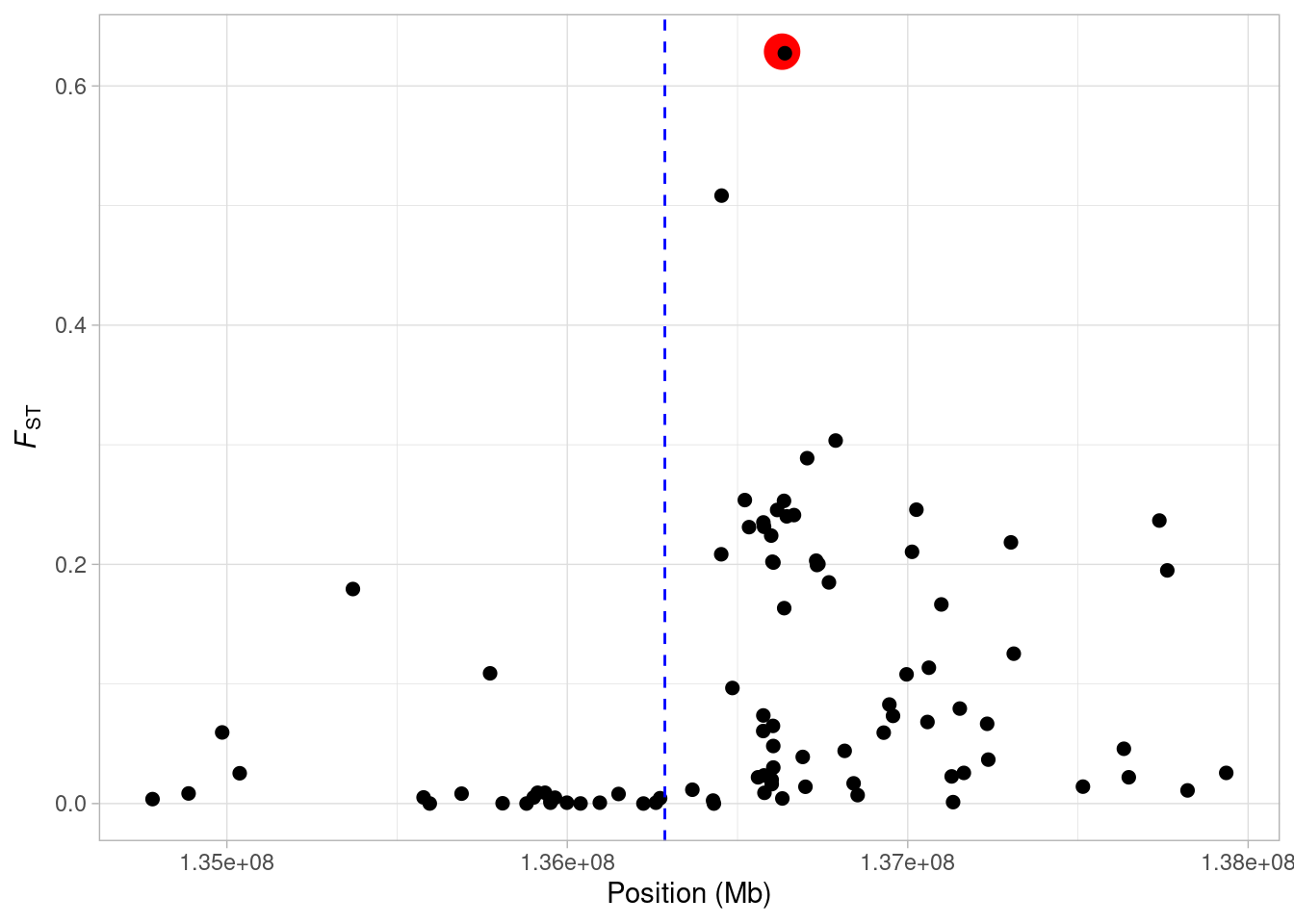
When the mid point of the gene is marked, it is clear that there is an increase in FST just upstream from the LCT gene. Perhaps we want to highlight the SNP that we calculated FST for in our first example?
This is a perfect opportunity to use the ifelse() function we learned about in Section 5.1.2. We can make a new column in our data based on whether or not lct_snps$snp_id is exactly equal to “rs4988235”.
Exercise: add a column named status to lct_snps using ifelse(). The column should contain “Yes” if the id is rs4988235, and “No” if it’s not.
Show hint
Start with lct_snps$status <- to assign the result to a new column.
Show another hint
The logical statement you need to use is lct_snps$snp_id == "rs4988235"
Now to highlight the SNP on our plot. We can make it big and colored this by mapping it to both the col and size aesthetic.
a <- ggplot(lct_snps, aes(coord, fst, col = status, size = status)) + geom_point()
a <- a + xlab("Position (Mb)") + ylab(expression(italic(F)[ST]))
a <- a + geom_vline(xintercept = lct_mid, lty = 2, col = "blue")
a <- a + theme_light() + theme(legend.position = "none")
a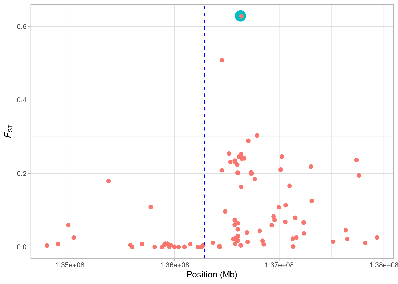
Now we see, our focal SNP is highlighted in the plot. We’ll change the colours to make it a little bit clearer.
In the next section, we’ll demonstrate how we can use the distribution of FST to identify outliers as potential targets of selection.
5.3.1 Identifying outliers in our FST distribution
How can we identify outliers in our FST data? First of all, we can look at the distribution of our data by making a histogram of fst.
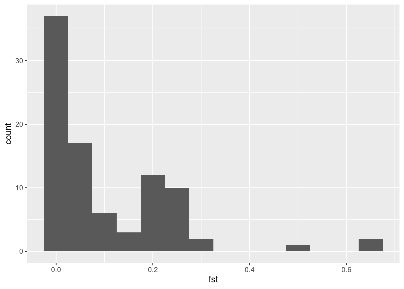
Now, it’s apparent that some values are way larger than the rest, but where do we set the threshold? One way to do it is to set some arbitrary value, and say that all values larger than this should be considered outliers. This can for instance be that we mark the highest 5% as outliers. In R, we can get this value with the quantile() function.
In the following example, we make a vector of numbers from 0 to 200, and use the quantile function to find the highest 5% (or lowest 95%).
The function returns 190, which means that 95% of the values are below 190, and 5% of the values are above 190 (which shouldn’t be all that surprising).
Now we use the quantile() function on our data to set the outlier threshold. Note that this time we need to add na.rm = T in order to ignore some loci which have no FST estimates.
# set threshold
threshold <- quantile(lct_snps$fst, 0.95, na.rm = T)
# plot histogram with threshold marked
a <- ggplot(lct_snps, aes(fst)) + geom_histogram(binwidth = 0.05)
a + geom_vline(xintercept = threshold, colour = "red", lty = 2, size = 1)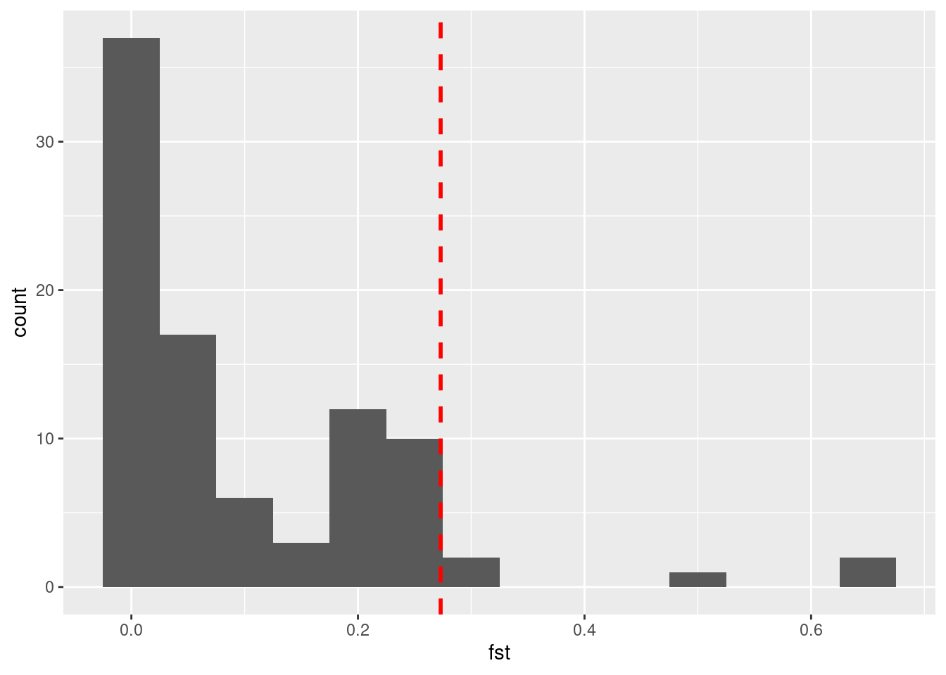
Now what if we want to visualise this on our chromosome-wide plot? Once again, we need to use the ifelse() function.
Take a look at the lct_snps data frame - you should now see an additional column which is a character vector with the status of each locus as either outlier or non-outlier. Next we can incorporate this into our plotting:
a <- ggplot(lct_snps, aes(coord, fst, colour = outlier)) + geom_point()
a <- a + xlab("Position (Mb)") + ylab(expression(italic(F)[ST]))
a <- a + geom_vline(xintercept = lct_mid, lty = 2, col = "blue")
a <- a + theme_light() + theme(legend.position = "bottom")
a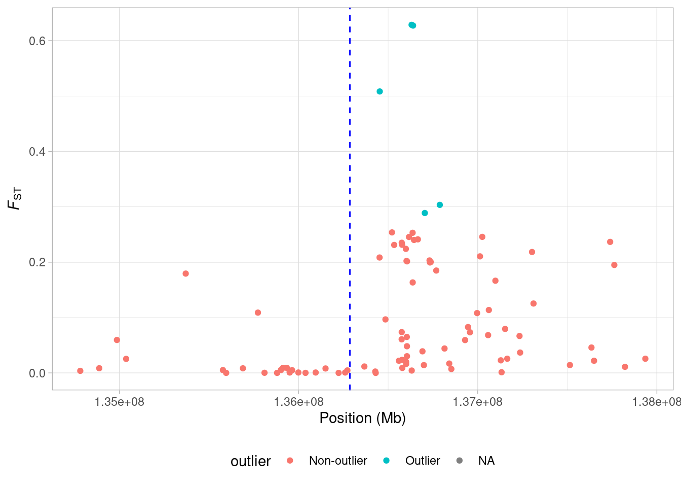
So now our potential outlier SNPs are marked on the figure. There are only 5 of them but they all occur just upstream from the LCT locus.
We cannot say for certain that these SNPs have increased FST values because of selection - other processes such as genetic drift or demographic history (i.e. a bottleneck in one of the two populations) might be responsible. However, given our knowledge that LCT is involved in lactase persistence, we can at least hypothesise that this is the case.
One important point to note here is that the threshold we set to identify a SNP as being potentially under selection is entirely arbitrary. In a way this line of thinking forces us to think of selection acting in some binary way on some SNPs and not others. This is obviously not the case. Still, for SNP data like this an FST scan can be a very useful tool.