7.1 Visualizing complex data
You have previously learned how to use aesthetics in ggplot to show many variables in a single plot (e.g., coloring points by group). Today you will learn a bit more about this. We will be working with the 2020 population data from the very first week, so make sure that is in your working directory.
We start by reading in the data (see if you manage to do this yourself before looking at my code):
For this tutorial, we will briefly investigate the correlation between fertility rate and life expectancy in the countries of the world. We can start by making a simple scatterplot.
Exercise: make a scatterplot of fertility rate against life expectancy using the world data
g <- ggplot(d, aes(Total_Fertility_Rate, Life_Expectancy_at_Birth))
# note: adding alpha = 0.5 to better see all points
g + geom_point(alpha = 0.5)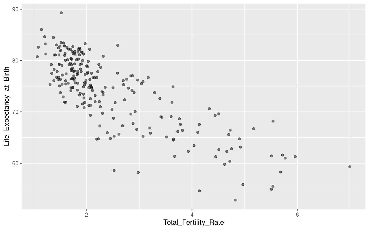
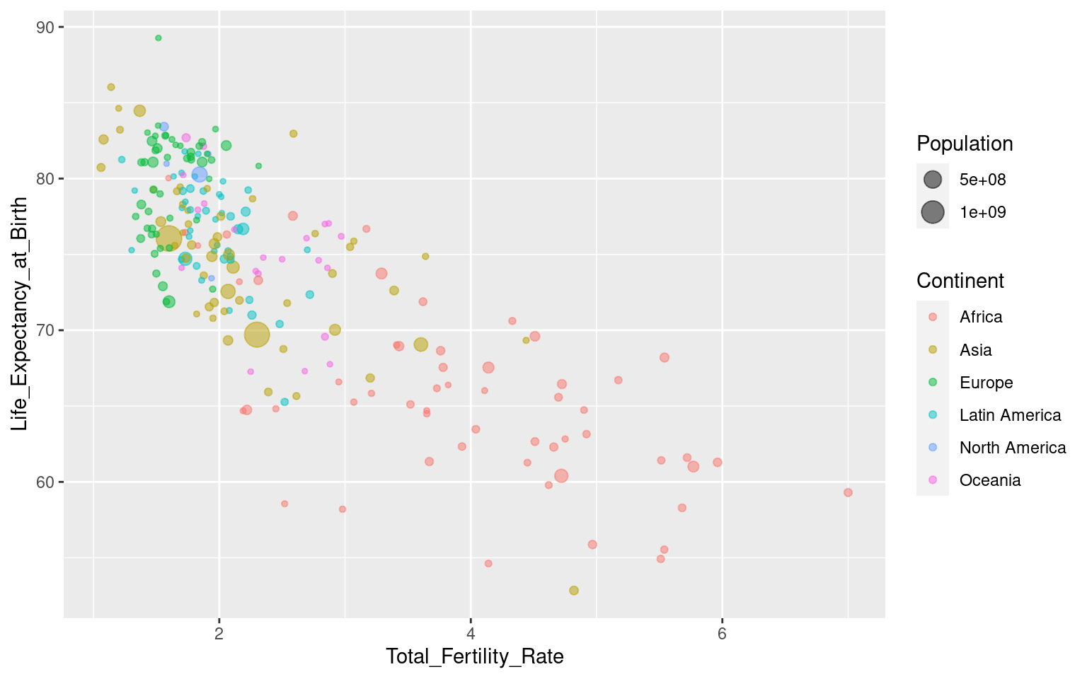
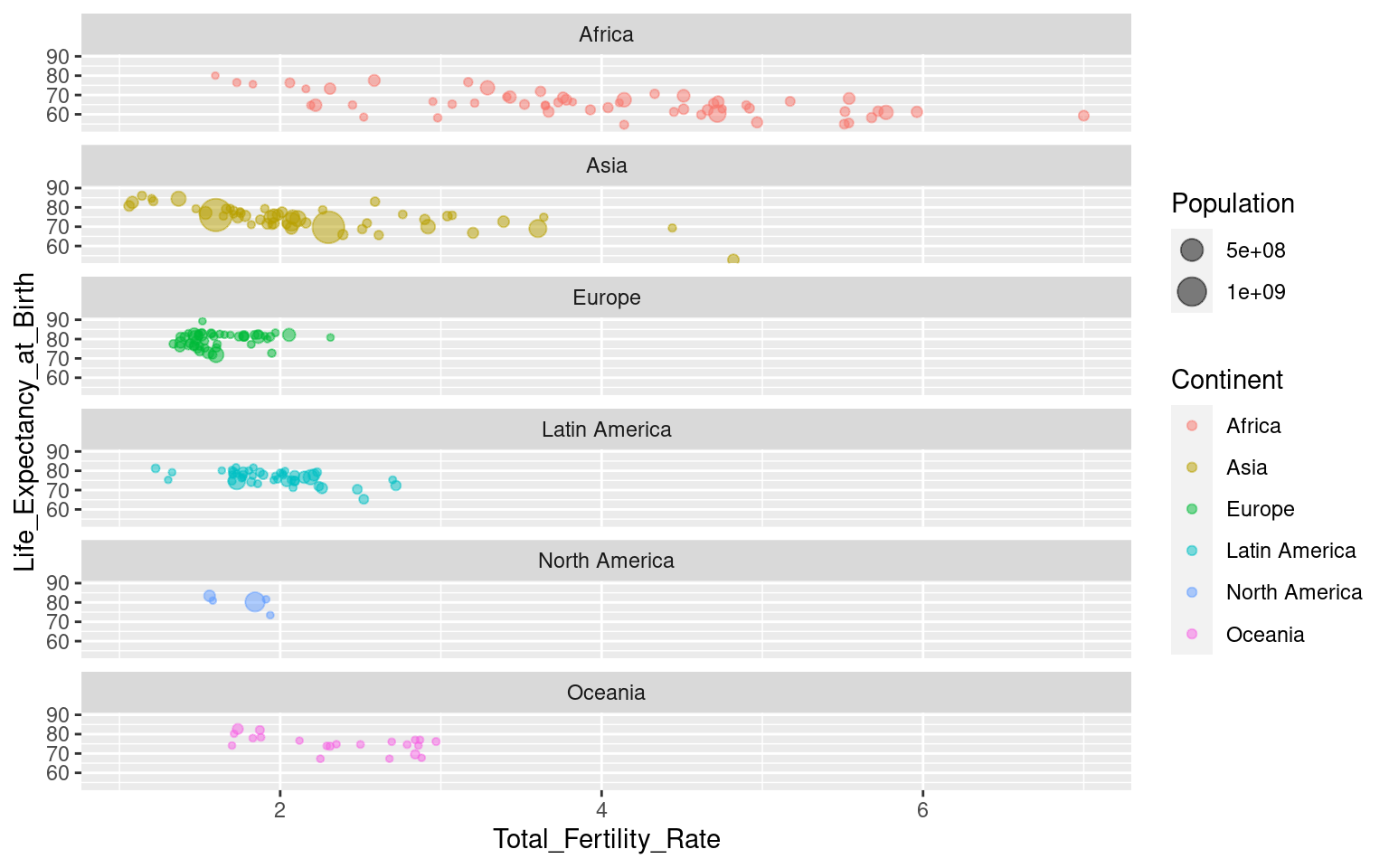
This shows a negative correlation between the variables: in countries with lower life expectancy, more children are born per woman. We can investigate this further by dividing the data by continent, and gain some additional perspective by showing the population sizes of each country.
Exercise: Update the plot by mapping colour to continent, and point size to population size.
7.1.1 Faceting
This is already quite a good plot, showing a lot of data at once. However, it can be a bit difficult to see trends within each continent (if that’s what we want to investigate), and what if we want to use colour for something else while still showing differences between continents? One way to do this is to divide the plot into several windows based on a variable, known as faceting.
Faceting in ggplot can be done by adding the function facet_wrap(). The syntax is a bit weird: facet_wrap(~Variable). It uses the ~ (tilde) character1, and is an exception to the “all variables go inside aes()”-rule that we have emphasized earlier. For our plot it looks like this:
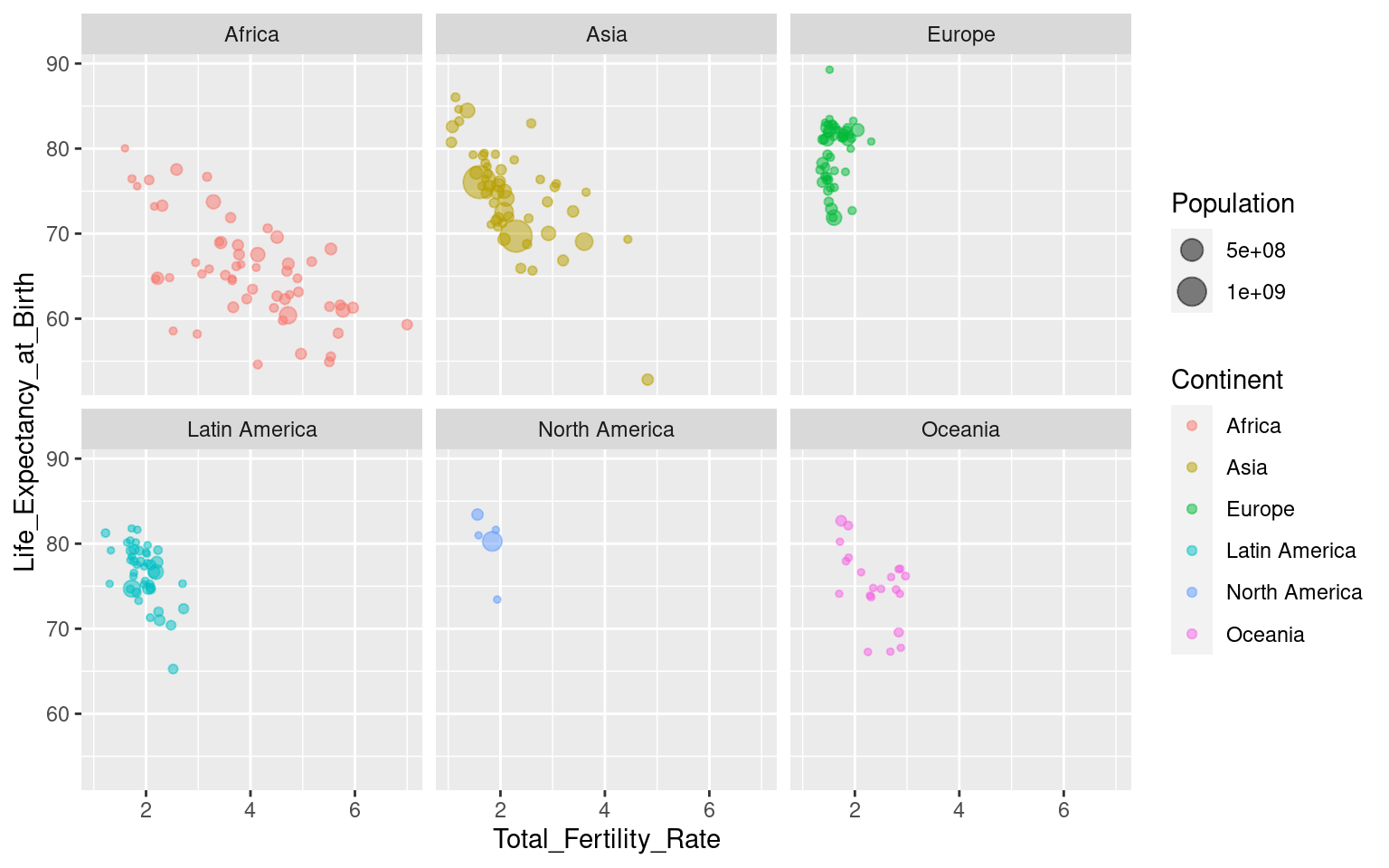
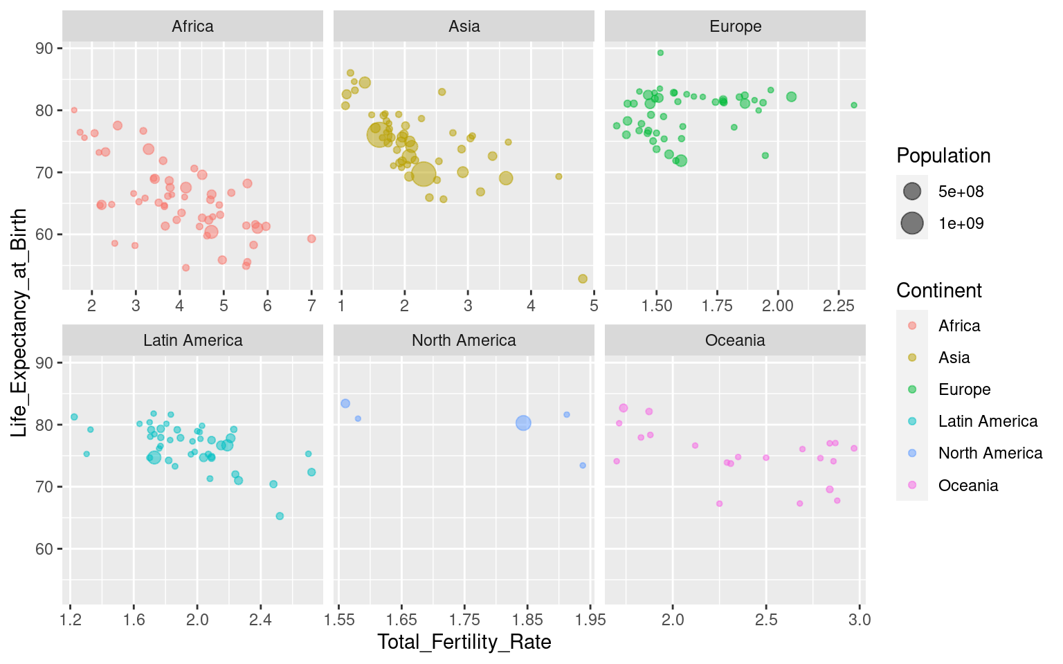
You can control the layout by using the nrow and ncol arguments to specify numbers of rows and/or columns:
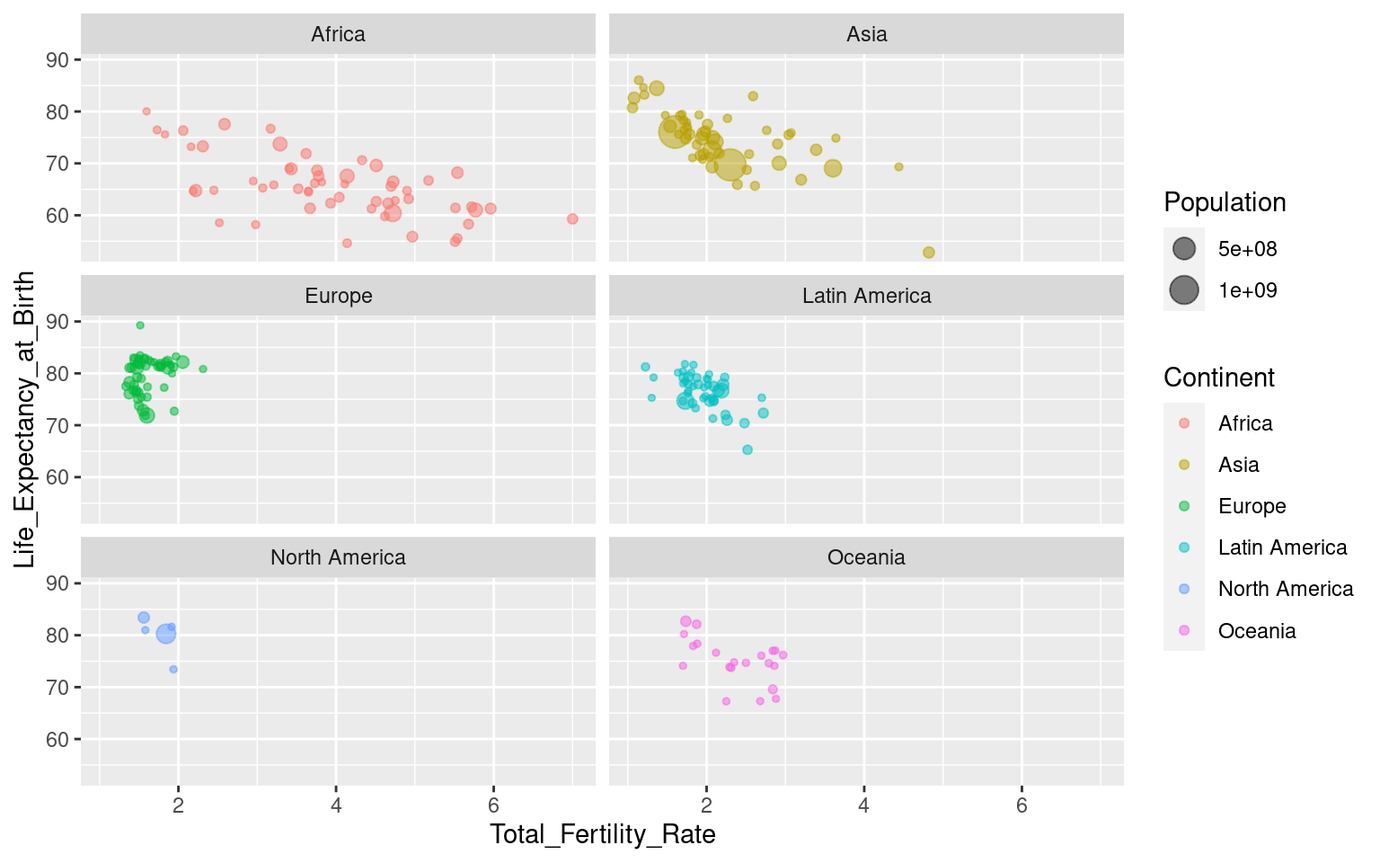
Note that all axes are the same across the facets. This can be changed with the argument scales, where you can specify “free”, “free_y” or “free_x”. Be aware that this can be misleading in some cases (like this one, I would argue), so use it with caution! “free_x” is shown below, but try the others yourself to see what happens!
Now you have learned some tools for visualising various statistics across the sparrow genome for later. Let’s jump into the evolutionary biology part!
Which can be read as “modeled by” or simply “by”, i.e., “facet by
Variable”.↩︎