1.4 Plotting
This part of the tutorial is very brief, since we will focus on plotting with ggplot2 next week. If you want to know more about plotting in so-called base R, check out this tutorial!
R is a powerful tool for visualizing your data. You can make almost any kind of plot, revealing connections that are hard to see from summary statistics. In this section, we will only go through some very basic plotting, you will learn more about plotting next week.
The basic function for plotting in R is simply plot(). This function will guess what kind of plot to make based on the data you provide. You can supply many arguments to the plot() function to get the visualisation you want, which we will show some examples of here.
1.4.1 Plotting vectors
The simplest way of plotting in R is by plotting two vectors of equal length. One vector gives the x-value, and another gives the y-value.
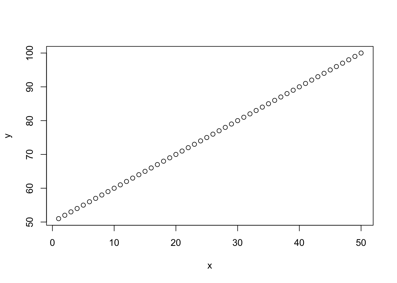
Figure 1.1: Two vectors plotted against each other.
As you can see, it makes a simple plot of our data, using points as the default. If we want to make a line graph we have to specify type = "l":

Figure 1.2: The same plot as above, but with a line graph instead
For all the different ´type´ arguments, see the plot-function’s help page by running ?plot.
You can use the functions lines() and points() to add elements to an existing plot instead of creating a new one:
plot(x, y, type = "l")
lines(x, y - 5, col = "red")
points(c(0, 10, 15), c(60, 80, 70), col = "blue")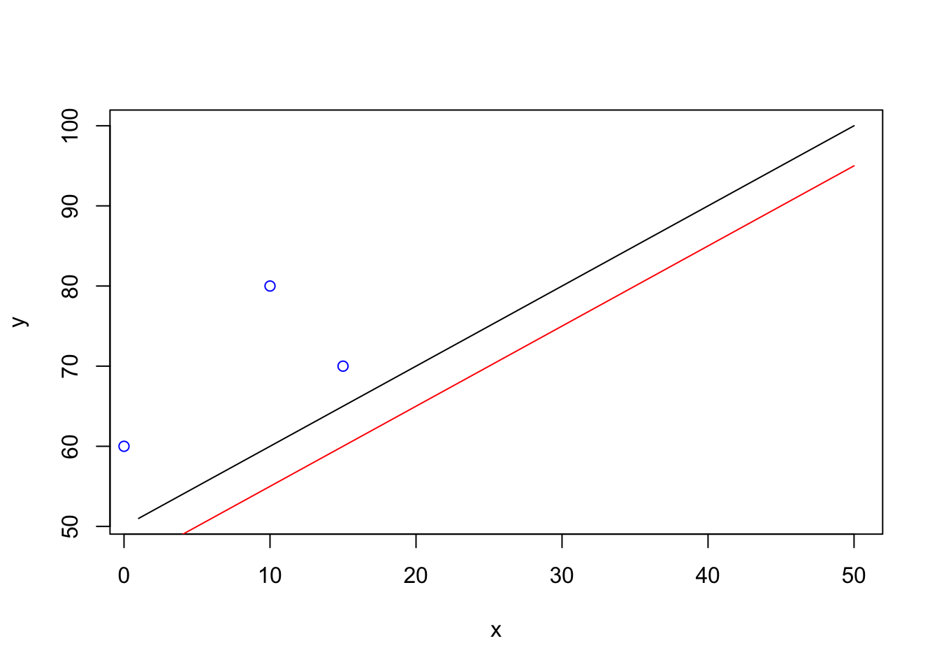
Figure 1.3: Plot with added line (red) and added points (blue)
You can use the hist() function to create simple histograms, as shown with the Total_Fertility_Rate column of world_data in the example below
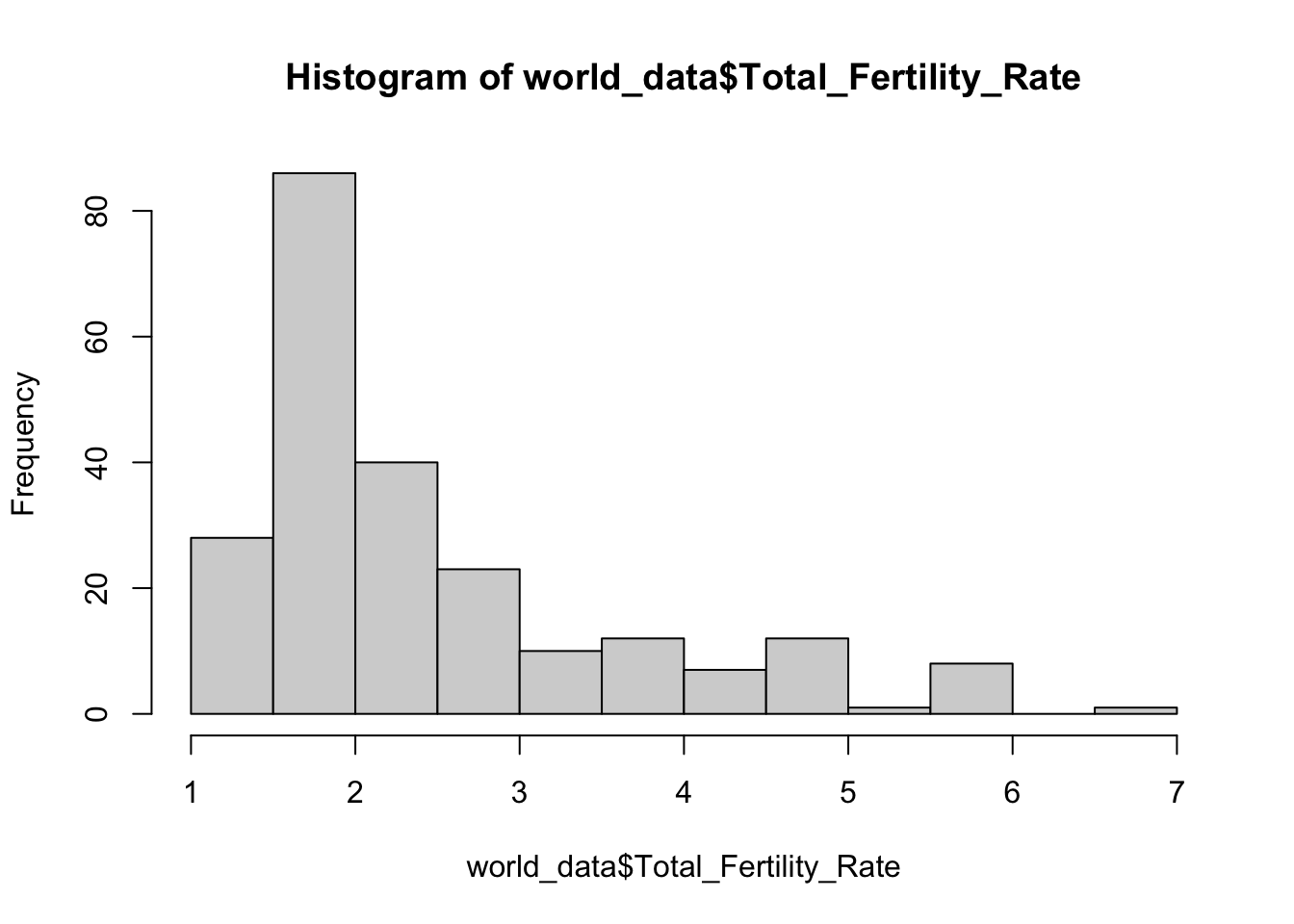
Figure 1.4: Distribution of fertility rate in the countries of the world.
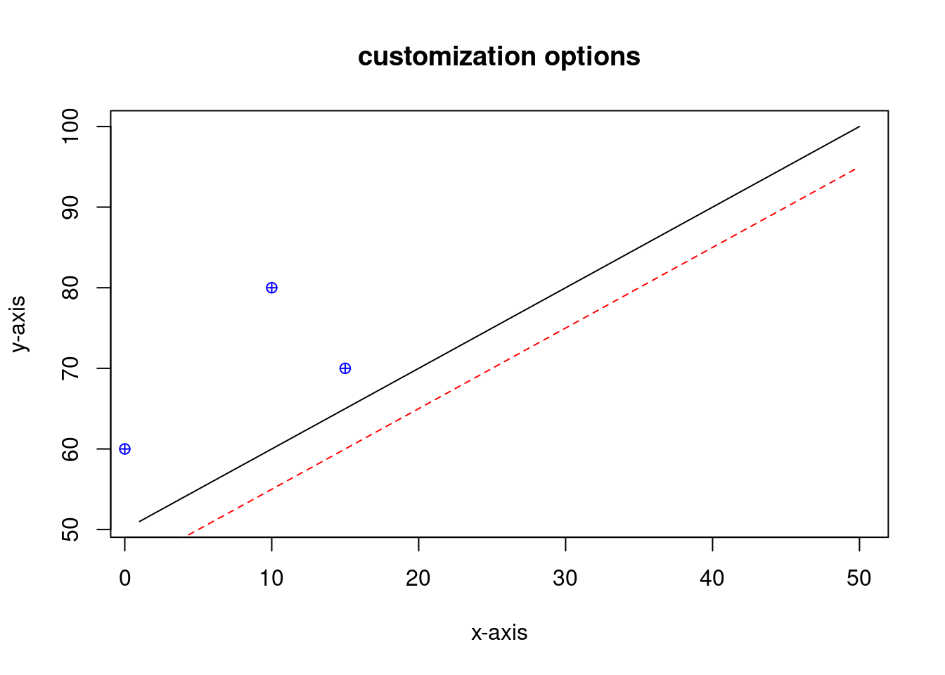
1.4.2 Customizing your plots
The plot() (and lines() and points()) function contains a lot of arguments to customize your plots. Below is a (non-comprehensive) list of parameters and what they do:
colchanges the color of the plotpchchanges the shape of your pointsltychanges line typemainchanges the titlexlabandylabchanges the axis labels
Below is an example that uses all these arguments in a single plot, see if you can follow what happens.
plot(x, y,
     type = "l",
     main = "customization options",
     xlab = "x-axis",
     ylab = "y-axis")
lines(x, y - 5,
      col = "red",
      lty = 2)
points(c(0, 10, 15), c(60, 80, 70),
       col = "blue",
       pch = 10)