6.1 Tools for investigating differences between groups
Comparing traits between different groups is an important part of evolutionary biology (and biology as a whole). For example, you often want to compare traits in different species, or different genotypes or sexes within a species. This section will teach you some R and statistics tools to do this.
6.1.1 Exploring group differences
For this section, we will use the iris data set, which is built in with your R installation. The data are already in R, so you can look at it by running:
irisTake a look at the iris dataset. The data frame contains four measurements (Sepal.Length, Sepal.Width, Petal.Length and Petal.Width) and also a fifth column, Species which lets us know the species for each observation. For our investigation, we will use species as a grouping (as it’s the only group present in the data).
6.1.1.1 Investigating with dplyr
A great tool for working with groups is (perhaps unsurprisingly) the group_by() function in dplyr that you learned about in the second week of this course. We can for example count the number of observations of each species with group_by() and tally():
iris %>%
  group_by(Species) %>%
  tally()
#> # A tibble: 3 × 2
#>   Species        n
#>   <fct>      <int>
#> 1 setosa        50
#> 2 versicolor    50
#> 3 virginica     50
We can see that we have 50 observations of each species. As you may remember, group_by() can also be used together with summarise() to produce grouped summaries. Say we want to find the mean petal length of each group, we can run:
iris %>%
  group_by(Species) %>%
  summarise(mean_petal_length = mean(Petal.Length))
#> # A tibble: 3 × 2
#>   Species    mean_petal_length
#>   <fct>                  <dbl>
#> 1 setosa                  1.46
#> 2 versicolor              4.26
#> 3 virginica               5.55
There appears to be a difference in petal length between species. To investigate further, we can also calculate multiple values in a single summarise(), e.g., median and standard deviation.
iris %>%
  group_by(Species) %>%
  summarise(mean_petal_length = mean(Petal.Length),
            median_petal_length = median(Petal.Length),
            sd_petal_length = sd(Petal.Length))
#> # A tibble: 3 × 4
#>   Species    mean_petal_length median_petal_length sd_petal_length
#>   <fct>                  <dbl>               <dbl>           <dbl>
#> 1 setosa                  1.46                1.5            0.174
#> 2 versicolor              4.26                4.35           0.470
#> 3 virginica               5.55                5.55           0.552
Remember that the argument names to summarise() could be anything, and end up as the column names of your new data frame.
6.1.1.2 Visualising differences
Looking at numbers like we did above is well and good, but good visualisations can often tell you more than summary statistics. A good way of visualising group differences is with a boxplot. This can be plotted in ggplot by adding geom_boxplot():
ggplot(iris, aes(Species, Petal.Length)) +
  geom_boxplot()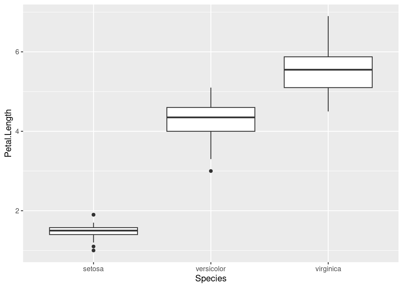
A boxplot can be a bit difficult to read if you’ve never seen one before, but here are the key features:
- The thick line in the middle of the box is the median
- The boundaries of the box are the 1st and 3rd quartile, i.e., half of your data is contained within the box23
- The lines outside the box are the range of non-outlier data, and the points are outliers
A boxplot is good at showing the distribution in the data. From this plot, we can see that the species obviously differ in this trait. But how large differences do we need to make confident conclusions? This is where statistic testing comes in24.
6.1.2 Analysis of variance (ANOVA)
6.1.2.1 What is ANOVA?
Analysis of variance or ANOVA is the name given to a family of statistical tests which we can use to test the differences among means from a sample. If you are familiar with a t-test, it is similar in the sense that it allows you to compare means; however unlike a t-test, ANOVA allows a comparison among multiple groups rather than just two. ANOVA and its related tests are also often referred to as linear models in R.
ANOVA and linear models are actually a very important group of tests and we employ them regularly in evolutionary biology. Indeed, ANOVA is essentially the basis of the QTL analysis which we will perform during the latter part of the tutorial. ANOVA also has another link to evolutionary biology - it was developed by R.A Fisher who was part of the modern synthesis of population genetics and evolutionary theory.
6.1.2.2 Using ANOVA to test for differences between groups
We can see from our boxplot that there appears to be some difference in petal length between species. Using ANOVA, we can formally test this. ANOVA is essentially a way to test whether the means of different groups are equal. Another way of putting it is that we’re testing if the variation between groups is larger than variation within groups.
To conduct an ANOVA in R, we will use the function aov() to create an object we will call model:
model <- aov(Petal.Length ~ Species, data = iris)Above, we used a formula as our first argument Petal.Length ~ Species25. This is essentially like saying, “How does petal length vary with species”? This part of our argument to aov specifies what we are actually testing. We also added data = iris to specify that we are using the iris data for this calculation.
Next we can examine the output of our model, to get an understanding of what it shows. To do this, we need to use a special function, summary():
summary(model)By using summary, we return an ANOVA table. The first row of the table is for Species. The two last values in this row are an F statistic and a p-value. We will return to what the F statistic actually means in a short while.
Let’s focus instead on the p-value. This is essentially a way of determining whether the results we see could be explained by chance. It is a test of significance — we did something similar with the Chi-squared test back in Chapter 3. In the biological sciences, we have an arbitrary cutoff for a p-value, set at 0.05. If our p-value is lower than this, then we can say that our dependent variable is significantly different among the groups.
Here we can see that our p-value is small—less than 2 x 10-16—which tells us that petal length is signficiantly different between species. The asterisks after the p value are also there to tell us this - *** simply means that our p-value is close to zero.
6.1.2.3 ANOVA and the proportion of variance explained
So far, we have learned about ANOVA in it’s simplest form - i.e. to test for differences among means. But this is not the only way we can think about it and the clue is in the name - it analyses variance. What do we mean by this? To illustrate it, let’s have a look at the total distribution of Petal.Length from the iris data. We can do this using a histogram (with geom_histogram()26).
ggplot(iris, aes(Petal.Length)) + geom_histogram()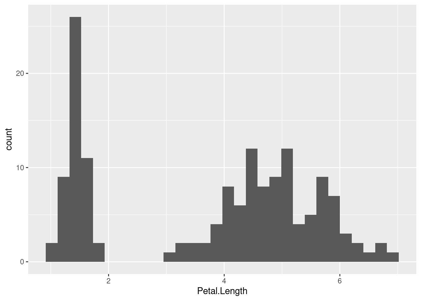
So, this time we are visualising petal length for all species grouped as one. Imagine for a moment you didn’t know that we have three species in our dataset. It is pretty obvious from this plot that there is a lot variation in petal length - there appear to be at least two and maybe three peaks in the data.
What might explain why there is so much variation? Well of course, we know there are actually three species included in these measurements. So, if we split our dataset into different species, can that explain the variance we observe? This is another way to think of ANOVA - as way of measuring the variance explained by how we split up the dataset.
So this brings us back to the F statistic. It is essentially a ratio of the variance explained by our grouping to the variance that occurs within each of them. One way to think of this is that the higher the value of F, the more likely our grouping explains a significant proportion of the variance in our data.
What if we want to actually measure how much variance our grouping (species here) actually explains. Luckily, this is very straightforward. We can look at a slightly different output from the model object we created earlier by using the function summary.lm().
summary.lm(model)There is a lot of information here! However, you should focus on the last two lines of the output. On the very last line, you will see the F statistic and p-value from when we called summary(model). Above that are two values of another statistic called the R-squared or R2.
Our R2 is 0.94 which essentially means that by grouping our data by species, we explain 94% of the variance in petal length. So clearly, species has a very important role in explaining the morphological differences in our data. One biological explanation for this is that genetic basis for petal length might be different between the species. We will see in the next section how we can apply a more advanced version of ANOVA to actually determine the genetic basis of a trait.
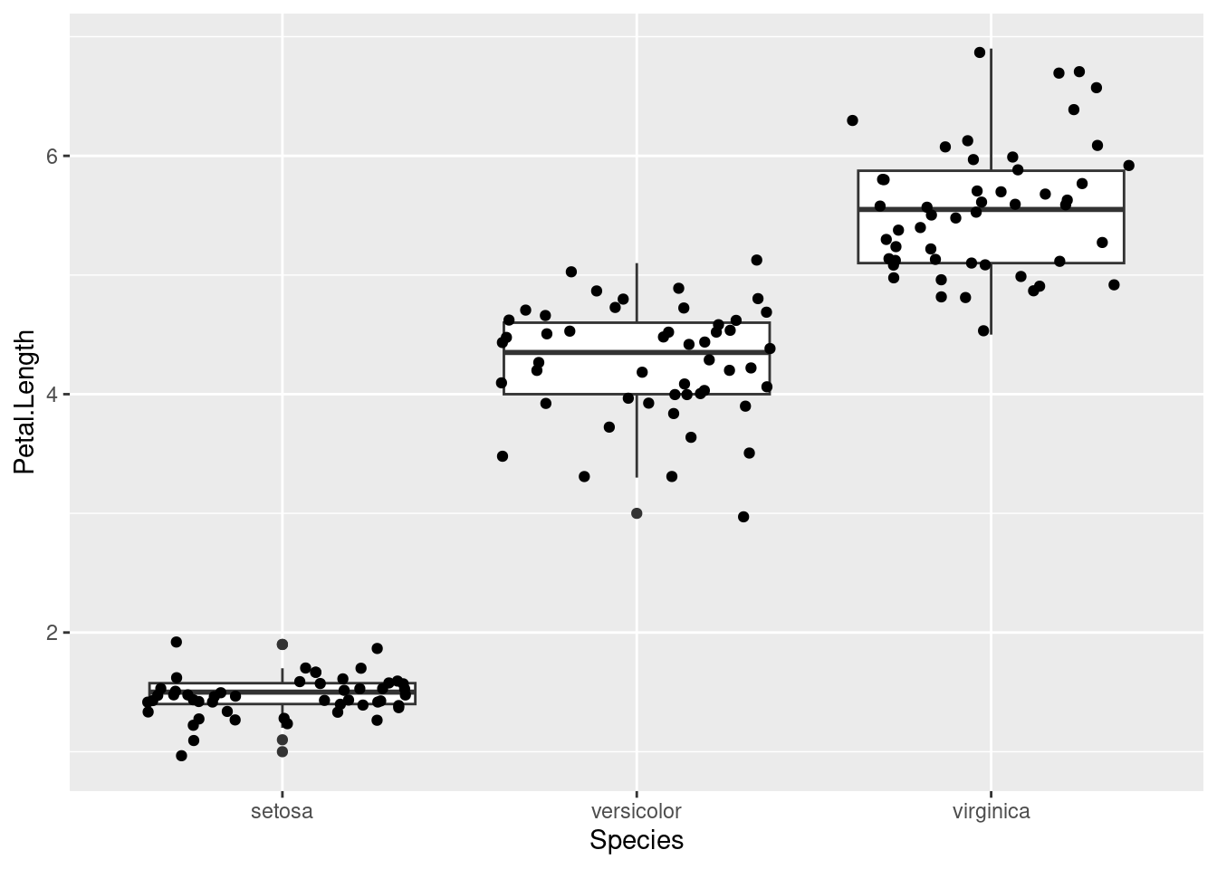
Remember that in
ggplot2, we can add more layers of geometry if we want to add information to our visualisation. Below, I’ve added points to the boxplot to show that half of the points are indeed located within the boundaries of the box.ggplot(iris, aes(Species, Petal.Length)) + geom_boxplot() + geom_jitter() # geom_jitter to prevent points from overlappingLike in Section 2.2 in week 3, where we tested for deviations from the Hardy-Weinberg expectation with a Chi-squared test.↩︎
The character
~is called “tilde”, in case you want to google how to produce it on your keyboard. In general, the tilde can be read as “modeled by”, in this case “petal length modeled by species”.↩︎Note how
geom_histogram()only uses a single aesthetic (x).ggplotmakes the y-axis for you, by counting the number of observations in each bin.↩︎